

![]()
The CAN/AM Hockey Group did not have a Web site prior to the launch of this site in 1999. They have a number of different types of hockey programs, each with their own print brochure. Visual consistency across print and online materials was needed, as well as having a cohesive Web site.
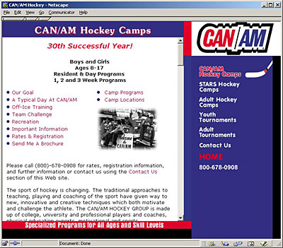
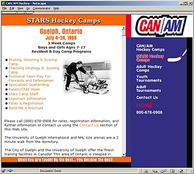
Colors and taglines for each camp were incorporated into their respective sections of the site, but the overall color palette for the site was derived from the CAN/AM logo.
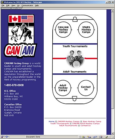
On the home page, the site features a hockey rink for the main navigation. As the cursor is rolled over the five circles on the rink, a black-and-white photo is pulled at random from a directory of images.
Throughout the site, the main navigation is on the right-hand side and features a hockey stick that both follows the movement of the cursor and acts as a page indicator once a section has been made. (Note: This doesn't currently work in the newest version of the Firefox browser in Mac OSX.) The secondary navigation is in the form of text links featured in bulletted lists at the top of each main page.
Click the links below to explore the site in more detail.
![]()
![]()